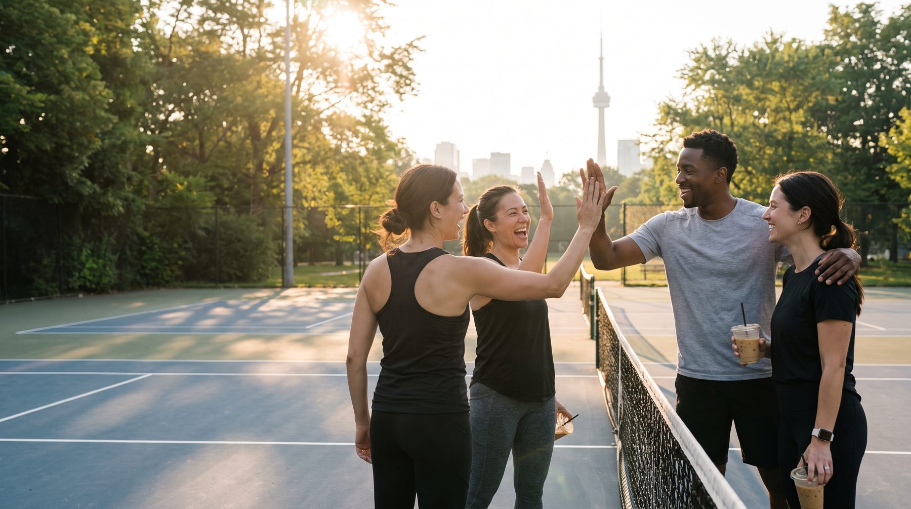
Your court.
Your crew.
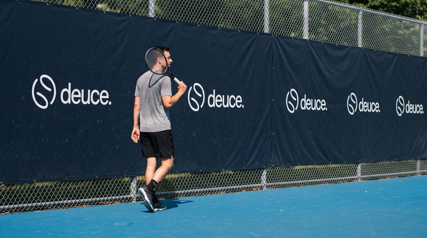
How deuce looks, sounds and shows up, from the app icon to a court fence in Toronto.
deuce means two.
Every friendship on deuce starts the same way: two people agree to meet on a court. A deuce is a pair, and the first game is how a pair becomes a crew. In tennis, deuce is also the moment both sides are level, which is how every new friendship should start: on equal footing.
Help adults find real belonging by making it easy to play with someone new.
Sport is the vehicle and belonging is the destination. deuce finds the game, the court and people at your level, then makes it easy to keep playing with the ones you click with. The wordmark is lowercase and friendly, like a message from a friend. The period means it's settled: you've got a game, and someone to play it with.
Every product, design and partnership decision gets checked against these.
Belonging
The reason we exist. Nobody should move to a new city and wonder where their people are.
Community
How deuce feels. Every game is a chance to meet someone, and every next game is a chance to see them again.
Trust
What makes it work. Meeting a stranger on court only happens when you trust who's on the other side of the net.
Trust is the foundation of the product, so the brand shows it plainly and early. These are the signals players see before they agree to meet someone. The full safety approach lives in the strategy doc.
Verified Player
A quick live selfie confirms you're the person in your photos.
Court Cred
Games played, show-up rate and reply time, on every profile.
Vouches
One tap after every game: showed up, great energy, would play again.
Match sharing
Send the time, place and partner to someone you trust, in one tap.
Verified players, women in control of who can reach them, and a person reading every report.
We never claim to be the first or the safest. We do the work and let players say it.
If deuce were a person, they'd be the friend who moved to three cities and made real friends in each one. Not because they're loud, but because they're warm, organised and always up for a game.
We are
- Warm
- Direct
- Human
- Inclusive
We are also
- Witty
- Playful
- Confident
- Honest
We are not
- Corporate
- Formal
- Generic
- Salesy
We are never
- Cold
- Intimidating
- Patronising
- Cliché
Two strokes, one rally.
Each stroke is a person. Neither one closes on its own, but together they make a ball: the thing two strangers share the moment they start to rally. The strokes are the same shape, turned to face each other, so neither one leads. It's a partnership, not a ranking.
The mark fits a circle 1.65 times the wordmark's ascender height, and the two share a vertical centre. Stroke B is Stroke A rotated 180°: the same shape and the same weight, facing each other as equals.
Keep a margin of x around the lockup, where x is the height of the mark. Nothing enters it: no type, no edges, no other logos.
Below these sizes the period and the inner curves fill in. Under 72px wide, use the mark on its own.
Use Colour in the product and anywhere the wordmark needs the most contrast, and Brand for marketing on neutral grounds. Use Neutral for one-colour print, embossing and co-branding, and On brand on Deuce Blue and the brand gradient.
The on-brand light and dark files you supplied are identical, so the system needs only one on-brand file. The downloads below list it once.
The logo is artwork, not type. Always use the supplied files.
One confident blue.
Blue is the colour of trust, and it sets us apart from racquet apps that default to greens and blacks. Deuce Blue is the only brand hue, used brightly and with confidence on the one action that matters. The product is dark-first like evening courts, and Optic is the ball, so it stays small.
RGB 0 134 246
RGB 11 11 11
RGB 22 22 22
RGB 250 250 250
RGB 182 182 182
RGB 0 0 55
RGB 195 247 255
RGB 212 242 74
A typical marketing layout. Blue carries the energy; if it covers more than a quarter of a dark layout, it stops feeling like a highlight.
WCAG 2.2 ratios for the pairs you'll use most. White on Deuce Blue passes only for large text (24px, or 18.7px bold), so keep blue buttons at 16px bold or larger and pair them with an icon where you can, as the design system does.
| Sample | Text on ground | Ratio | Result | Use for |
|---|---|---|---|---|
| Aa | Chalk on Ink #FAFAFA / #0B0B0B | 18.86:1 | AAA | Body text, dark |
| Aa | Line on Ink #B6B6B6 / #0B0B0B | 9.71:1 | AAA | Supporting text, dark |
| Aa | Deuce Blue on Ink #0086F6 / #0B0B0B | 5.38:1 | AA | Links and brand text, dark |
| Aa | White on Deuce Blue #FFFFFF / #0086F6 | 3.66:1 | Large text only | Button labels, 16px bold and up |
| Aa | White on gradient start #FFFFFF / #1D9AFF | 2.95:1 | Fail | Logo only, no text |
| Aa | Ink on Chalk #0B0B0B / #FAFAFA | 18.86:1 | AAA | Body text, light |
| Aa | Link Blue on Chalk #0070D6 / #FAFAFA | 4.69:1 | AA | Links and brand text, light |
| Aa | Deuce Blue on Chalk #0086F6 / #FAFAFA | 3.50:1 | Large text only | Logo and headlines 24px+, light |
| Aa | Chalk on Night #FAFAFA / #000037 | 19.07:1 | AAA | Tinted cards |
| Aa | Ink on Optic #0B0B0B / #D4F24A | 15.56:1 | AAA | Stickers and merch |
Figtree does the talking.
deuce is sans serif only. Figtree carries everything from headlines to labels, using the design system's Header styles for anything that leads, and Fira Code keeps scores and times lined up.
FIGTREE · 400 / 700 · Google Fonts
ABCDEFGHIJKLMNOPQRSTUVWXYZ
abcdefghijklmnopqrstuvwxyz
0123456789 · & ? ! ( ) – —
Find your people through sport.
Screen titles use Header 1 (28/36). Default UI text is Body 2 (14/20), and reading text is Body 1 (16/24). Strong styles are Bold.
FIGTREE BOLD · HEADER STYLES · Headlines
Your court. Your crew.
Headlines, campaign lines and pull quotes use the Header styles (Bold). At display sizes, tighten tracking to about −3% so the word shapes stay compact.
FIRA CODE · 400 / 500 · Data
7–65 3–6 6–4
Use it for scores, set tables, times, levels and booking references. Its figures are tabular, so columns of numbers stay aligned.
From the design system, Mobile platform. Marketing can scale display sizes up freely, but keep these ratios between steps.
Talk like a friend who knows your name.
Warm, direct and occasionally witty. We never lecture and never oversell. We celebrate the small human moments that make sport social: the rally that went 30 shots, the coffee after, the first time someone texts "same time next week?"
Lead with people
Names before features. "Priya accepted your match" beats "Request accepted."
Celebrate small wins
A first match deserves a moment. A tenth match deserves a milestone. So does a first vouch.
Never intimidate
A first-timer and a club regular should both feel deuce is for them.
Be exact
Times, places and costs are the message. Lead with them, keep it short.
The same message, written two ways.
Lead with the primary line, and use the others for campaigns and social.
Small vocabulary choices that keep us sounding like a friend, not a platform. We never say "lonely" in public copy; we talk about finding your people.
We say
- game
- players
- your crew
- your people
- Court Cred
- vouch
- show-up rate
- same time next week?
- Founding Member
We avoid
- users
- session
- opponent
- ratings
- ELO / MMR
- slot
- facility
- lonely
- dating
Real games, real light.
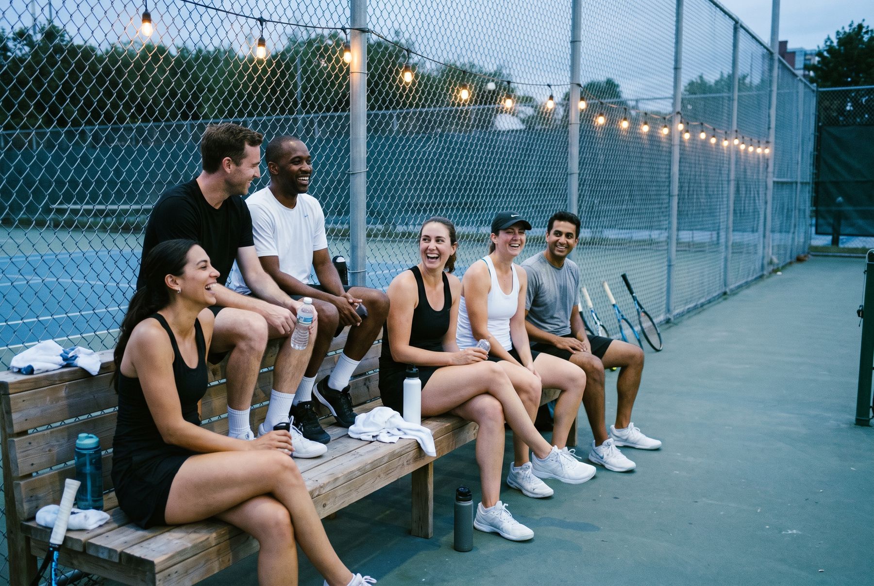
Candid over posed: real people mid-game or mid-laugh. The moment after the match matters as much as the match itself. Two people on a courtside bench, water bottles out, talking. That moment is the product.
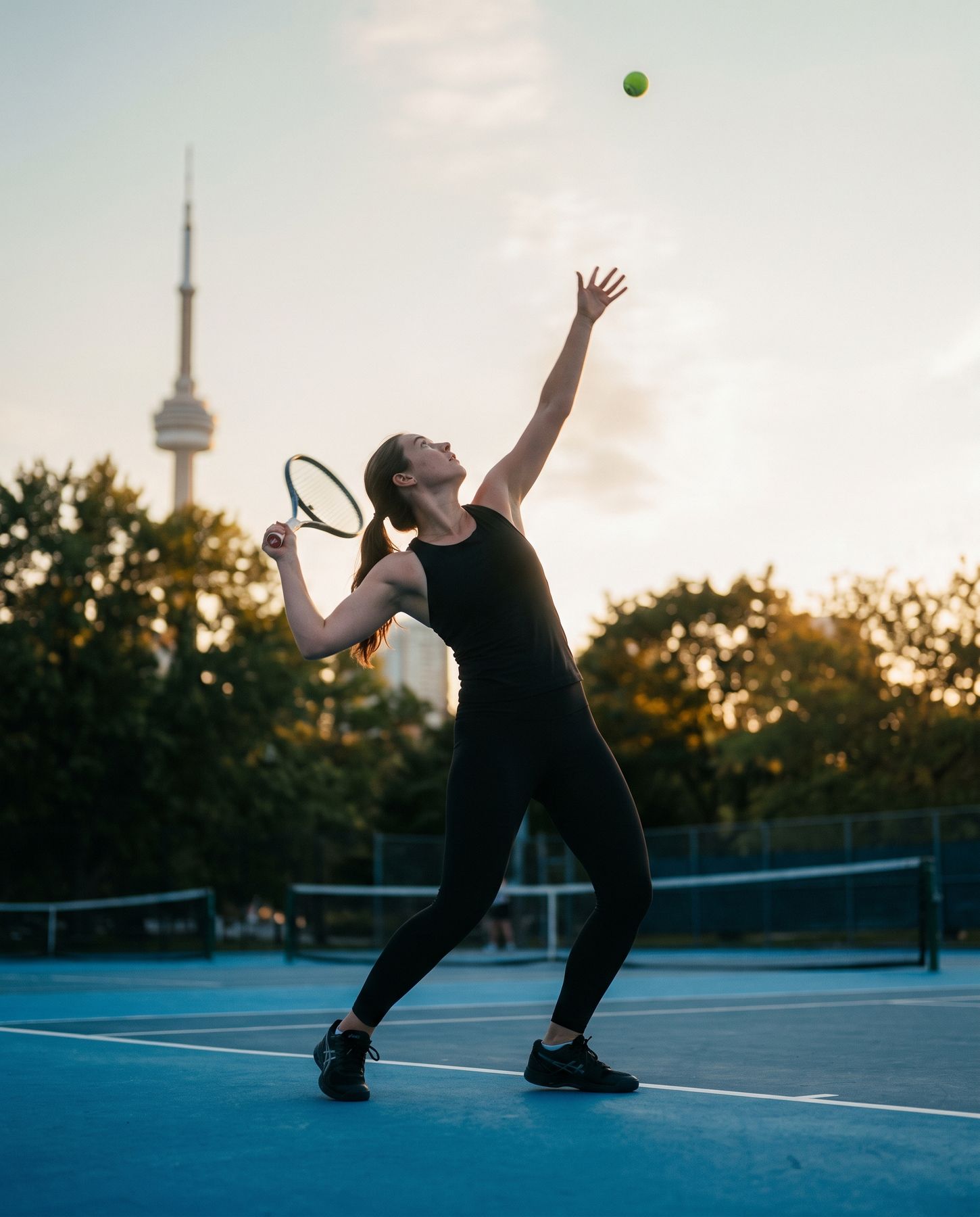

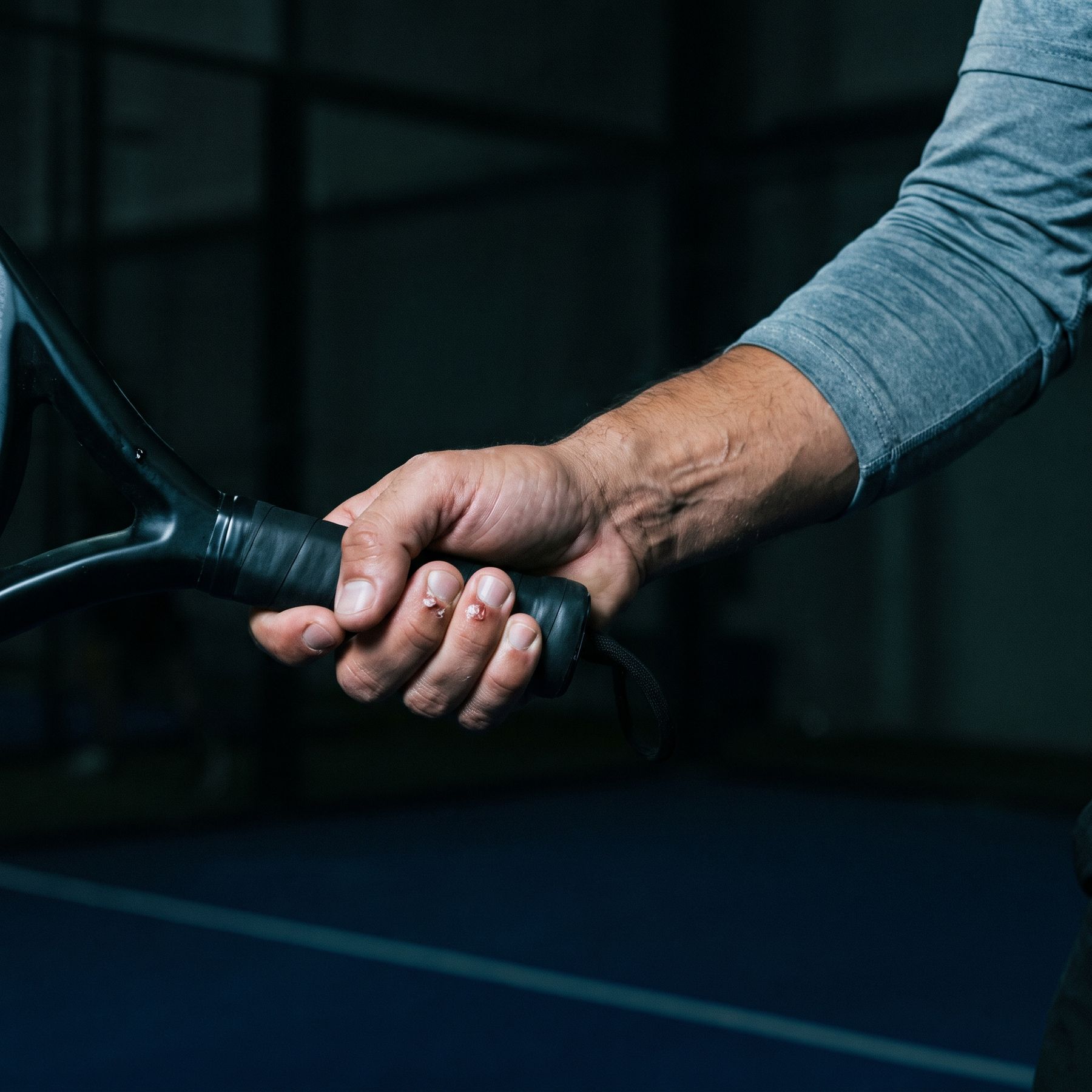
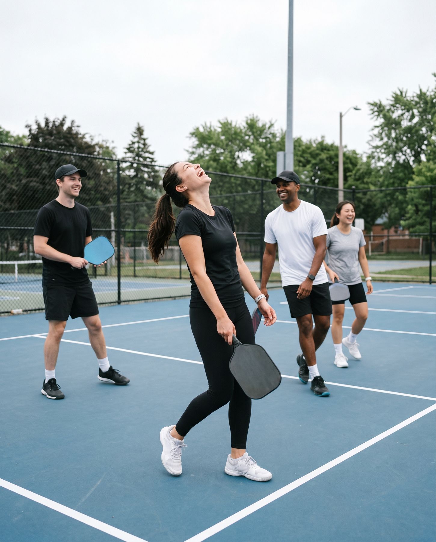
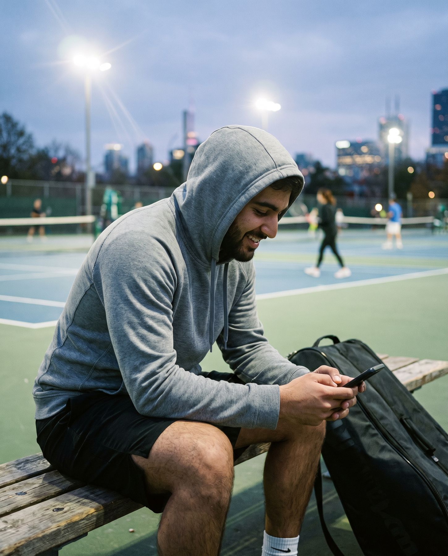
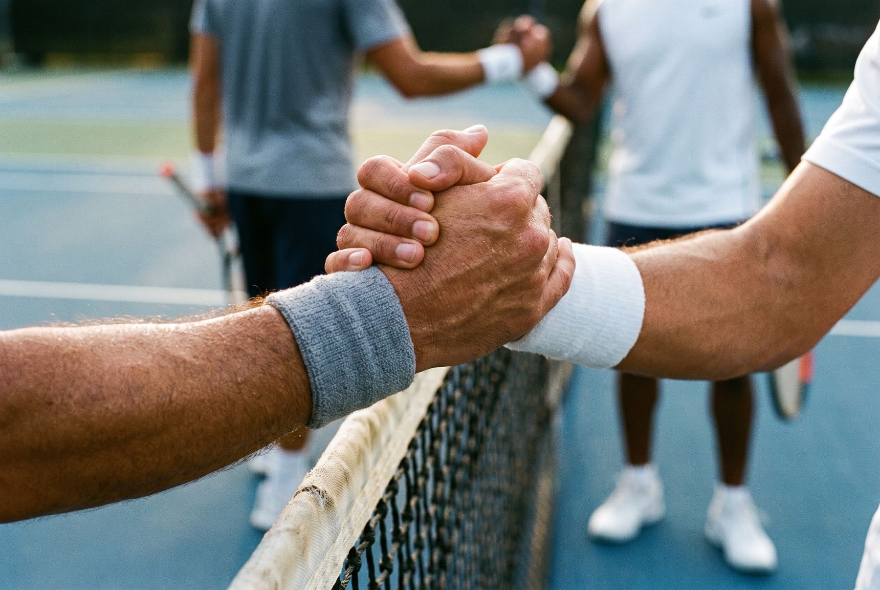
Mid-moment
Catch the reach, the laugh or the handshake. Nobody looks at the lens.
After the match
The bench, the coffee, the walk to the car. Shoot the friendship, not just the forehand.
Diverse by default
Toronto is one of the most multicultural cities in the world. Real ages, bodies and backgrounds, in plain kit with no sponsors.
Warm light, blue courts
Golden hour where we can get it, and blue court surfaces that carry the brand colour so the logo doesn't have to.
Flat court geometry, one optic ball and a soft ground shadow. Use these for empty and error states in the product. Each comes in a light and a dark version, and this page shows whichever matches your theme.
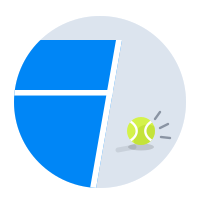
 Not found
 Something went wrong
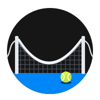 No connection

 Maintenance

 Location off
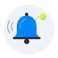
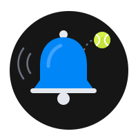 Notifications off
Quick off the line.
Motion explains a change; if it only decorates, we cut it. The logo animation is our one flourish: the two strokes swing in from opposite sides and meet: two people, one rally.
Duration tokens · Standard mode
0.2, 0, 0, 1
0.05, 0.7, 0.1, 1
0.3, 0, 0.8, 0.15
The logo reveal uses Slower (700ms) with Decelerate for the strokes, Slow (400ms) for the wordmark, and a single spring on the period. With Reduce Motion on, it becomes a 250ms fade.
The icon is the ball.
The mark on the brand gradient, sized at 62% of the tile so it survives the smallest Settings icon. iOS dark and tinted variants come from the same artwork.
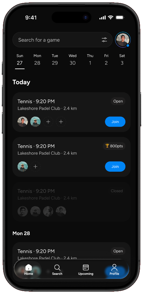
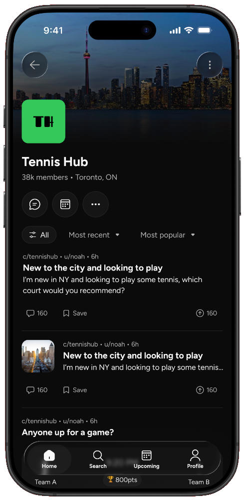
Each screenshot leads with one benefit in a Figtree header, over our photography, with a real screen from the app in front.
Your court.
Your crew.
Find your people
through sport.
Celebrate every
small win.
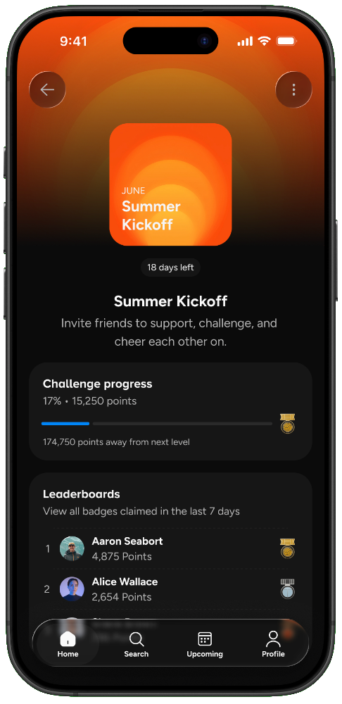
Lead with who and when. The app name already says deuce, so the copy never repeats it.
Same court, every screen.
The website and lifecycle email borrow the app's dark ground and pill controls, with Figtree Header styles set large for headlines.
Your court.
Your crew.
Find tennis, pickleball and padel players at your level in Toronto, then keep playing with the ones you click with. Book the court and split the cost in one place.
Let's find your first game.
Hi Priya, welcome to deuce. Three quick steps and you'll be on court this week, with people at your level near Liberty Village.
You're getting this because you joined deuce. Toronto, Canada · Email settings
Kit you'd actually play in.
Good blanks and small marks. Every piece should work on court first and as a logo second: a left-chest print on tees, the mark alone on caps, and the full lockup only where there's room.
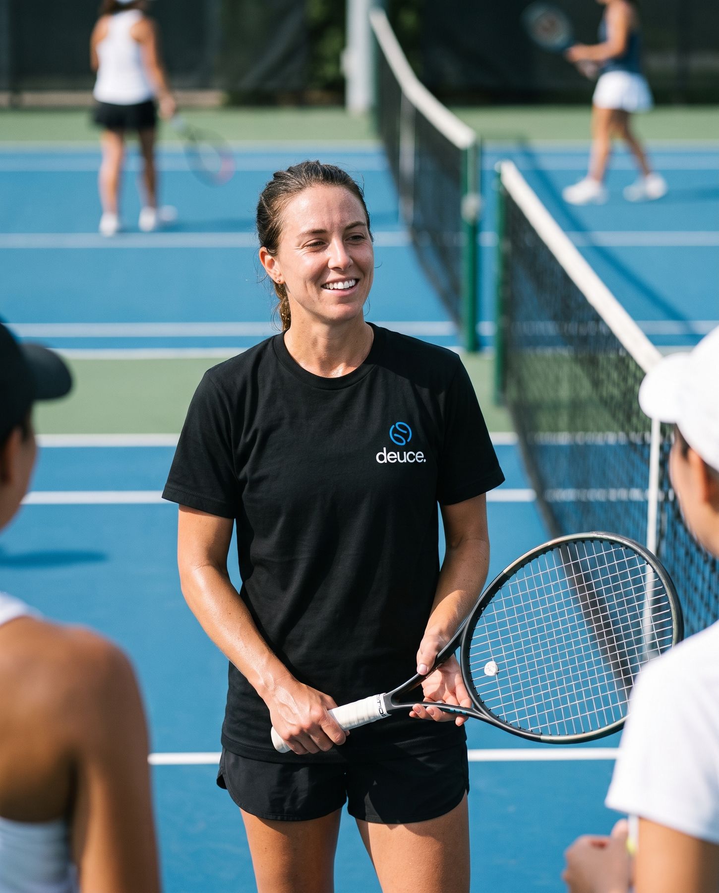
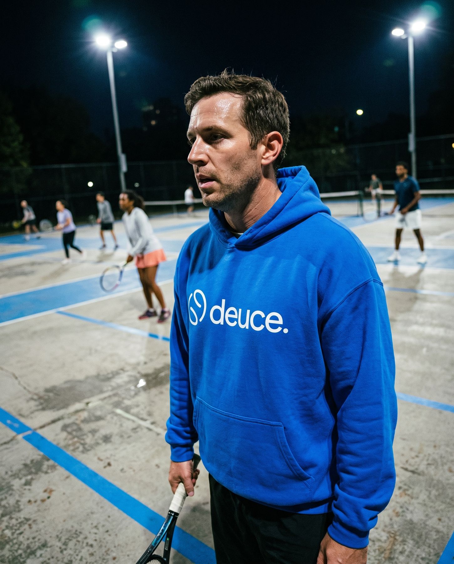
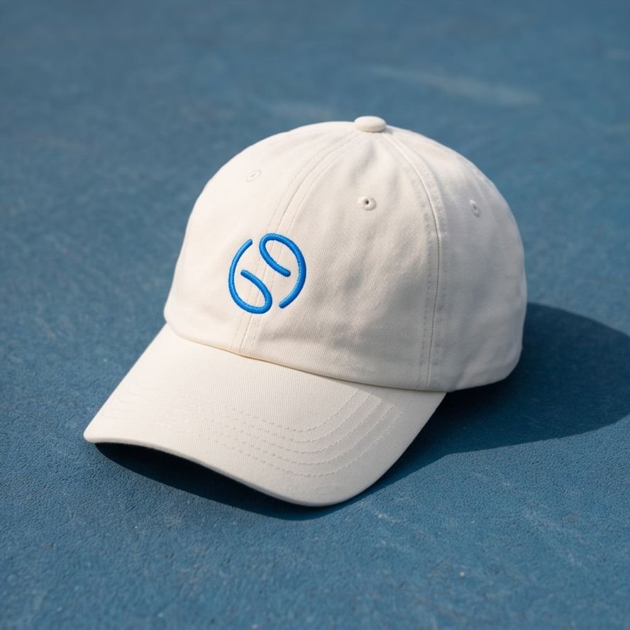
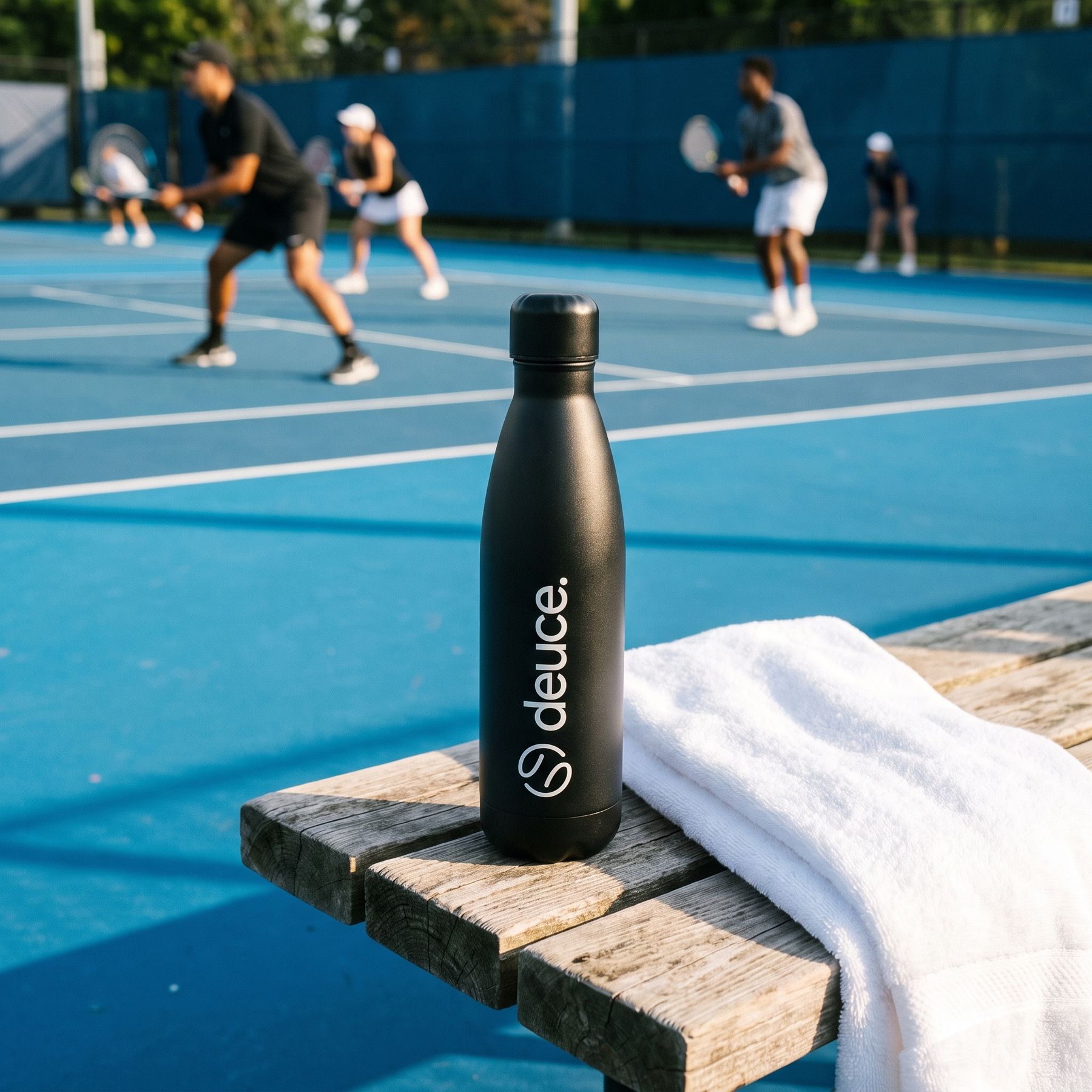
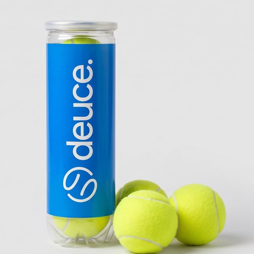
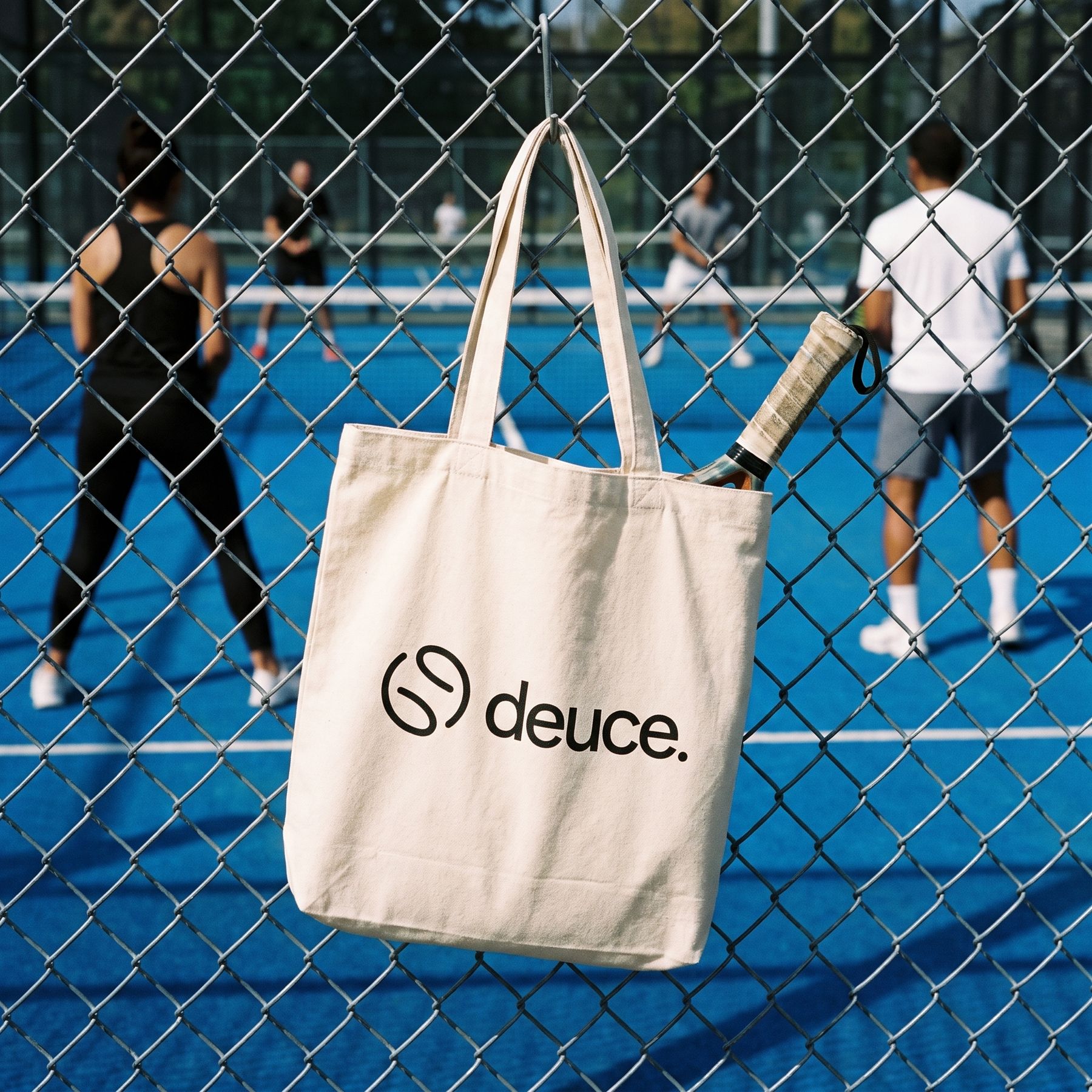
Member
Your crew.
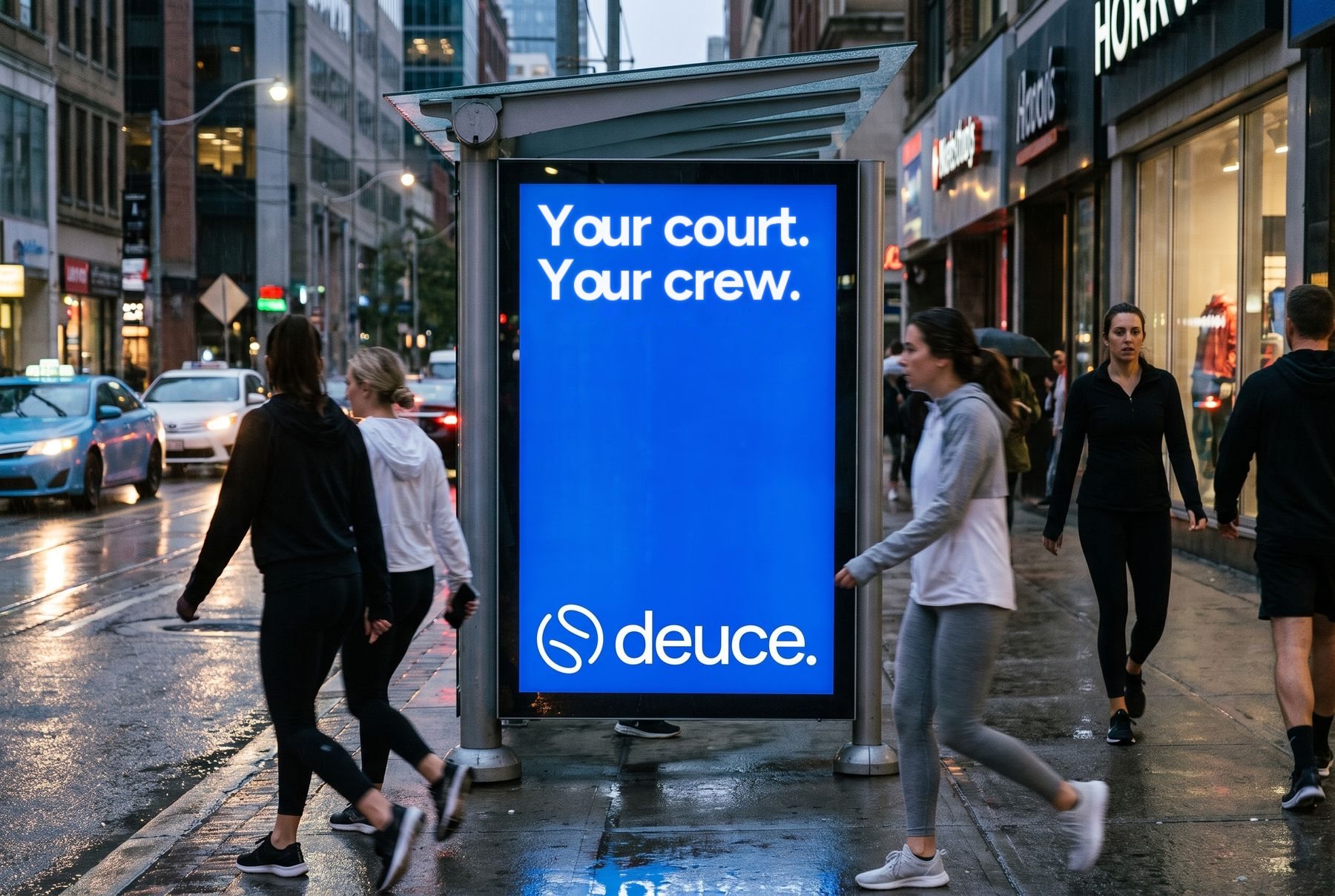
Big, simple and blue. One headline and the on-brand lockup, near the courts where people play.
Logo files
These are the master SVGs, without the background rectangle that was in the source files. Copy one and paste it into Figma, Keynote or code.
@playdeuce
Instagram and TikTok are where the crew lives. Lead with the human moment, not the feature. The mix is human stories (40%), community moments (25%), helpful and witty posts (20%) and product (15%), and every post uses one of these templates so the grid reads as one brand.
Open play.
Looking for a 4th
Padel · Tonight 8:30 pm · Toronto Padel ClubJoin gameplaydeuce.app
LinkedIn speaks to clubs and partners, and X carries launch news. Keep the logo out of the platform's avatar crop zone at bottom left.
Your crew.
Toronto.
The @playdeuce handle and the playdeuce.app domain are placeholders. Check that they're available before the name is final.